Cali Squeeze

PROJECT
PACKAGING DESIGN
COURSE
GR 370 PACKAGE DESIGN 3
INSTRUCTOR
THOMAS MCNULTY
SEMESTER
FALL 2024
[THE PROBLEM]
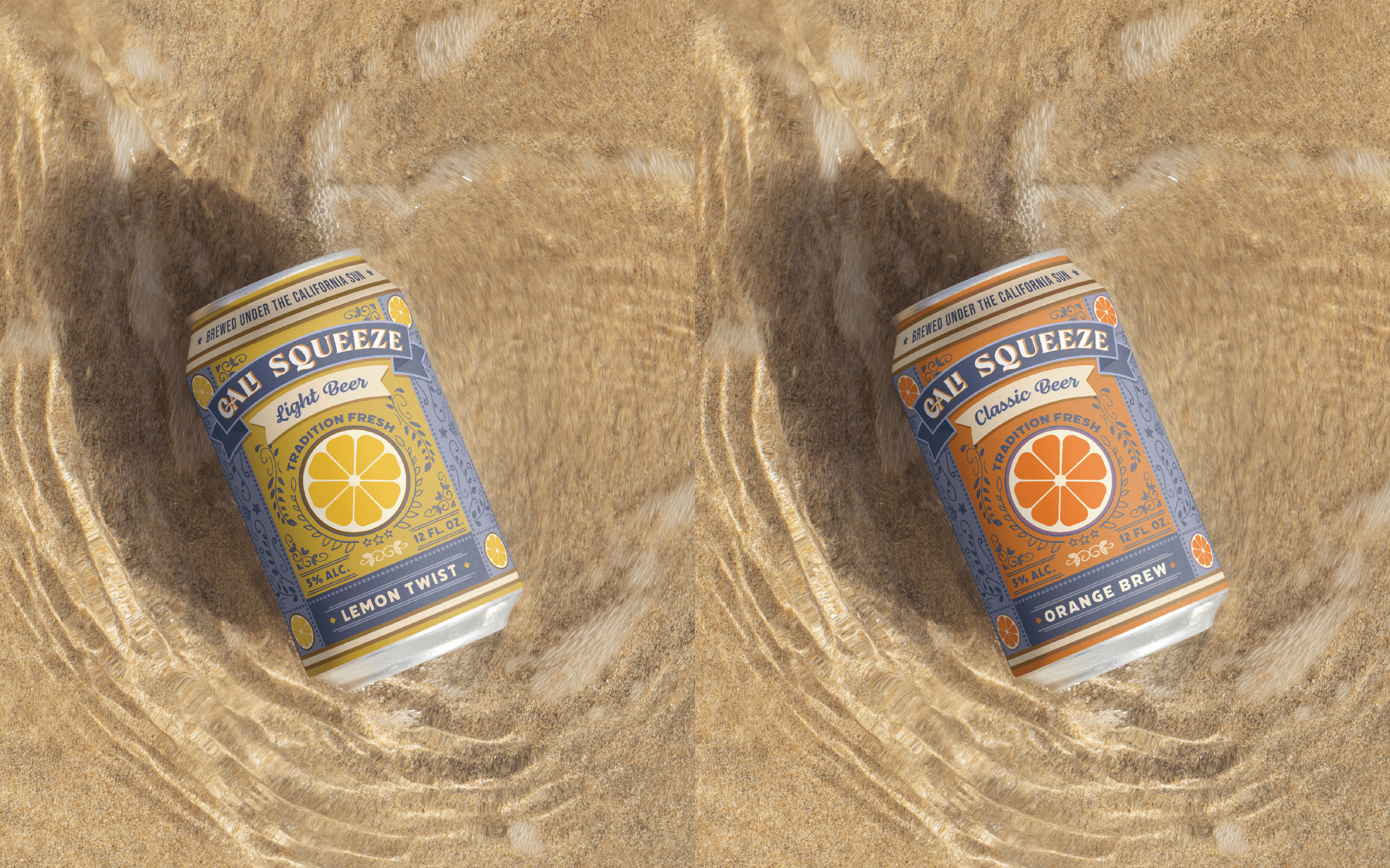
Design a playful and sustainable packaging identity for Cali Squeeze that celebrates bold fruit flavors and the relaxed, adventurous spirit of California’s vibrant beach culture.
[BACKGROUND]
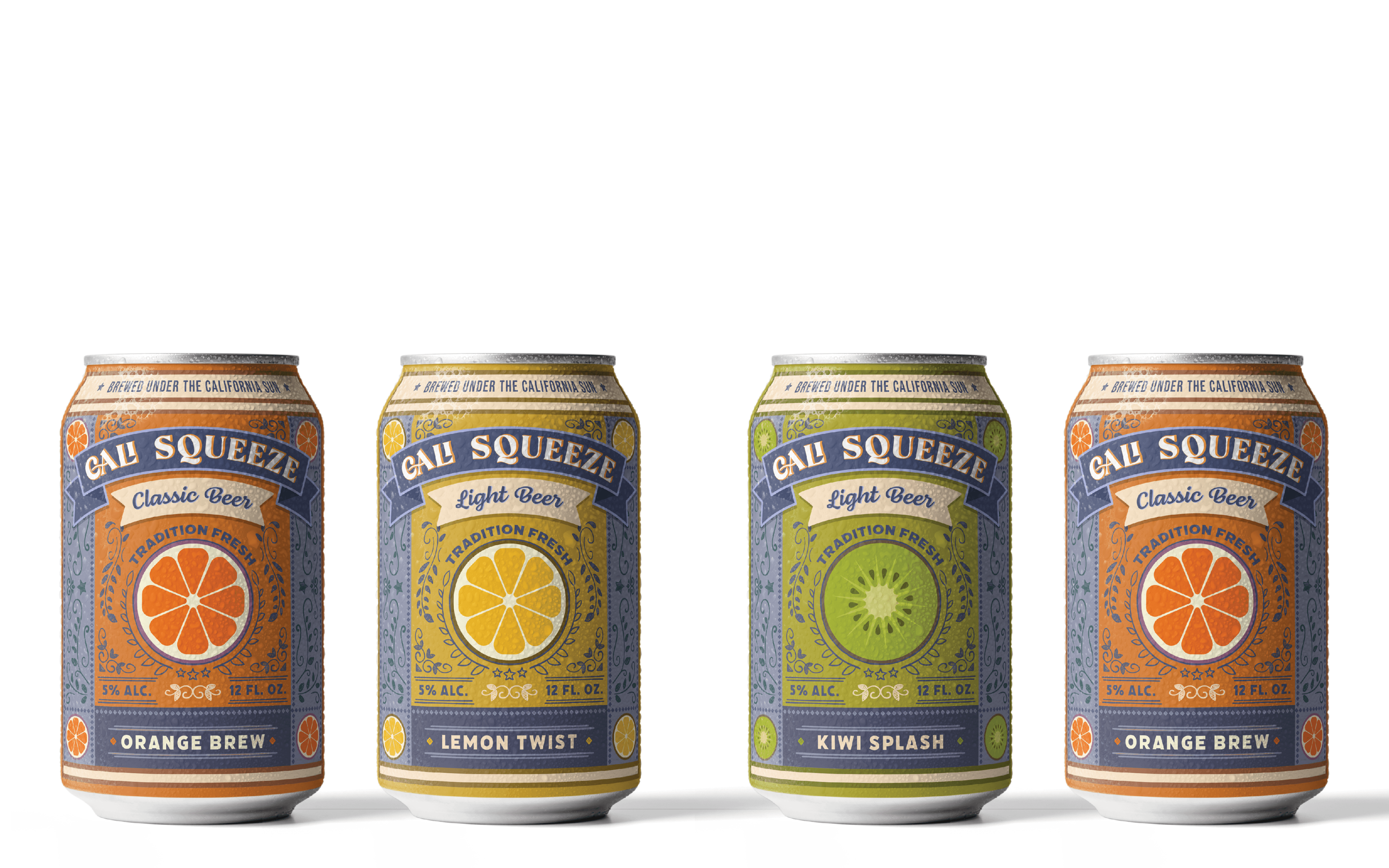
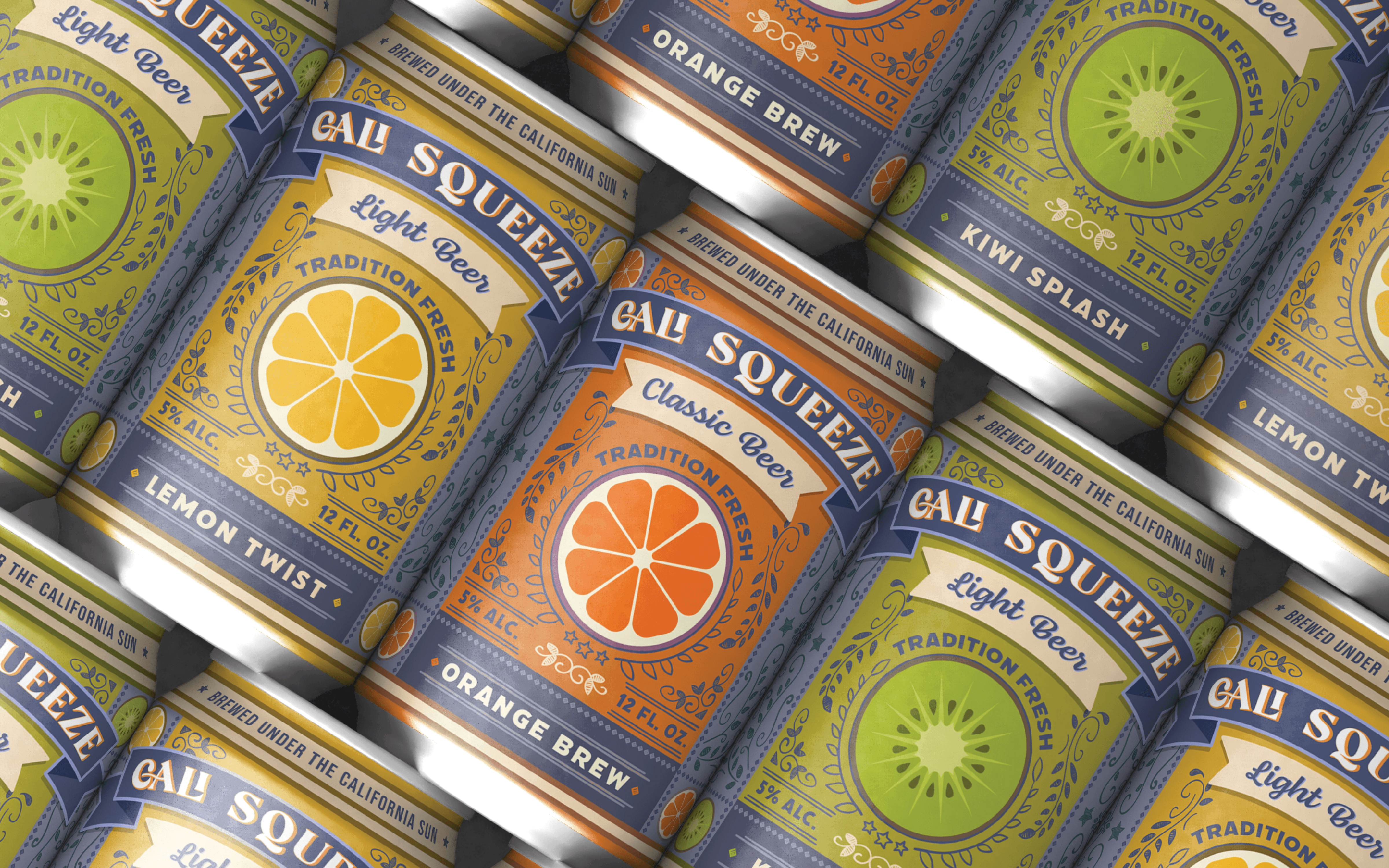
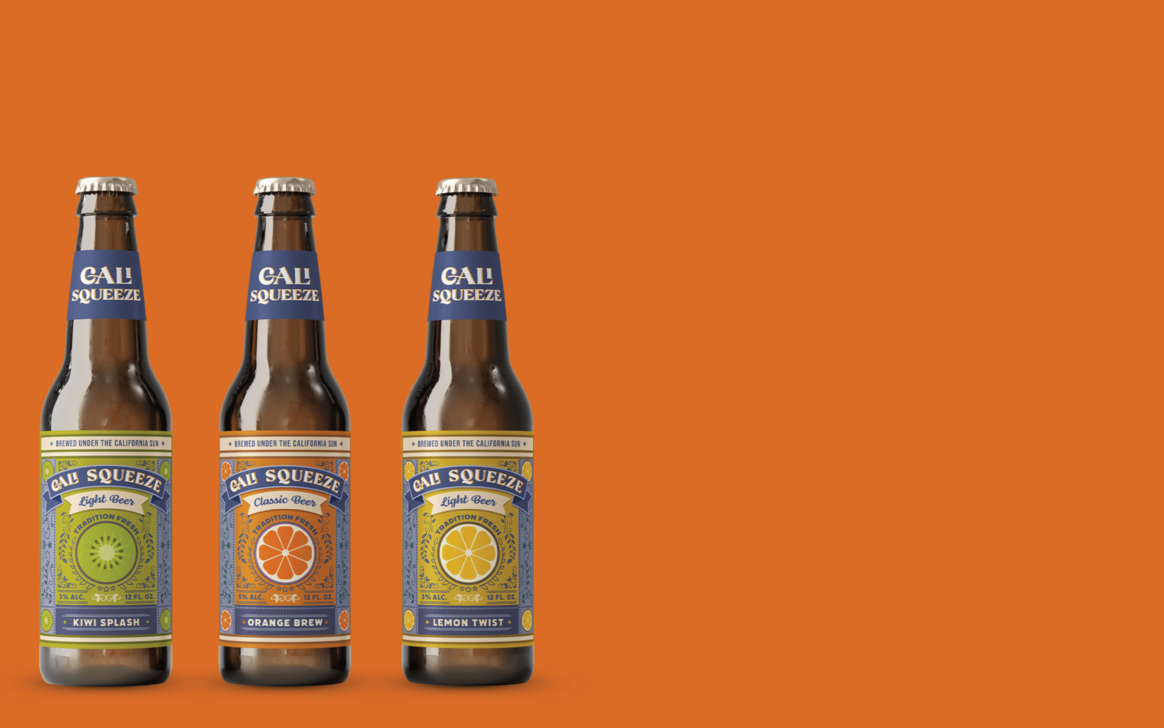
Cali Squeeze is known for bright infusions like blood orange and tropical lemon. Its identity merges craft quality with a carefree coastal vibe. The packaging had to feel approachable, vibrant, and nostalgic, without sacrificing shelf clarity or environmental responsibility. It needed to stand out visually, appeal to younger drinkers, and align with eco-conscious trends.
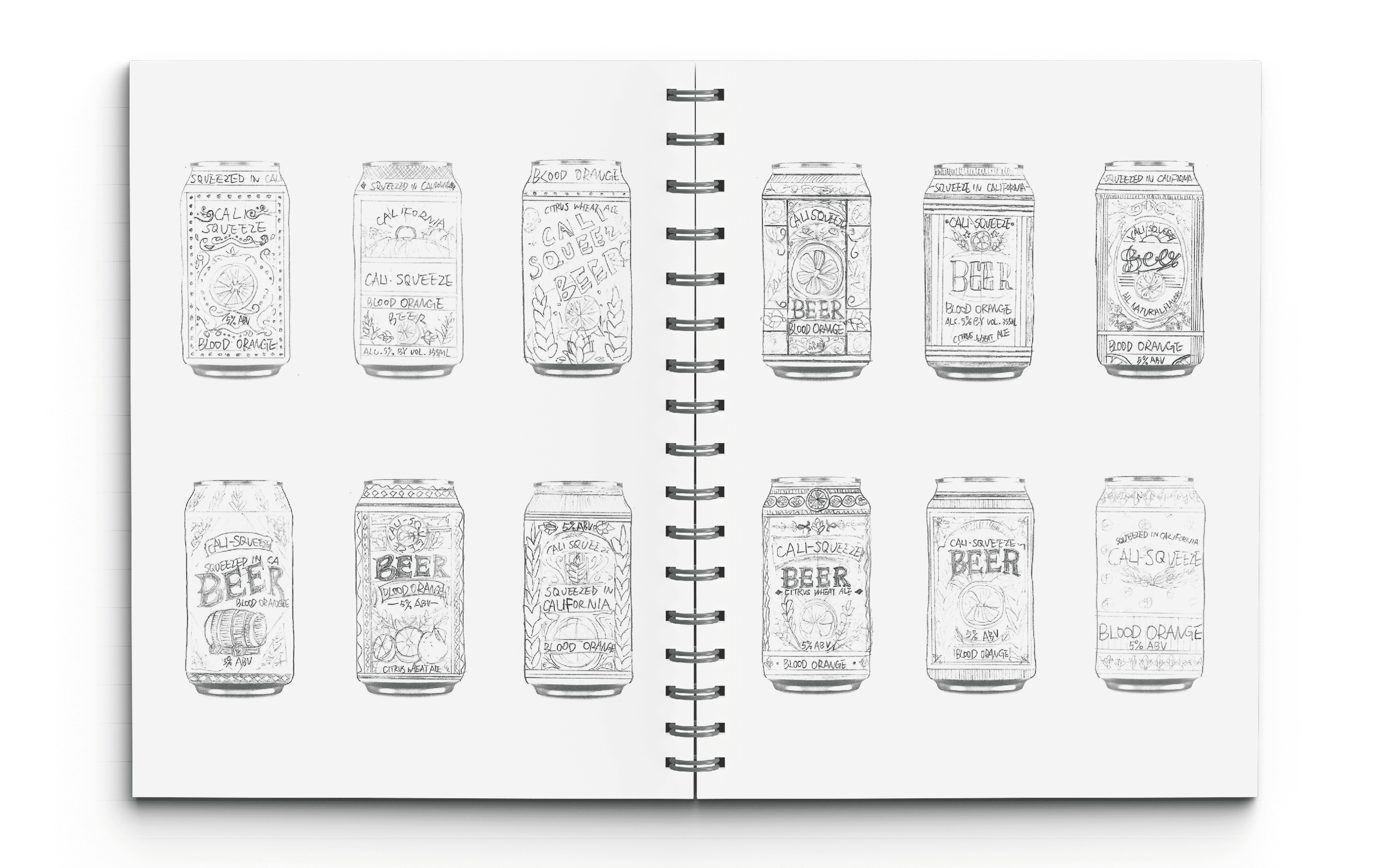
[SOLUTION]
I designed a packaging system rooted in retro revival, bold palettes, nostalgic typography, and sun-washed illustrations convey casual freshness. Each flavor carries its own color story while staying connected to the larger family. The system fuses vintage character with clean modern structure, evoking a playful spirit that’s as refreshing as the drink itself.